image
Sep 07, 2018

Xamarin Forms: Performance matters with Hierarchy Viewer


In the previous post of 'Xamarin Forms: Performance matters' I was looking for an optimization of the overdraw of pixels in a page, in this post I will focus on reducing the Visual Tree Size of a page. Reducing the number of elements on a page will make the page render faster.
There are two main techniques for achieving this:

  1. Hide elements that aren't visible. The IsVisible property of each element determines whether the element should be part of the visual tree or not.
  2. Remove unnecessary elements.

A tool that can present the Visual Tree of a page: Hierarchy Viewer in Android Device Monitor. Although the Hierarchy Viewer is deprecated by Microsoft it still runs fine.
The Android Device Monitor can be executed:

  • in Visual Studio via menu item: Tools > Android > Android Device Monitor
  • in windows explorer: directory C:\Program Files (x86)\Android\android-sdk\tools. Run monitor.bat as Administrator
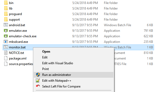
    Android Device Monitor

The Hierarchy Viewer doesn't run on a couple of devices; with the Android emulator the Hierarchy Viewer works fine. So before you start the Android Device monitor you have to start your app in the Android emulator and navigate to the page you want to view in the Hierarchy Viewer, for instance the Products page.
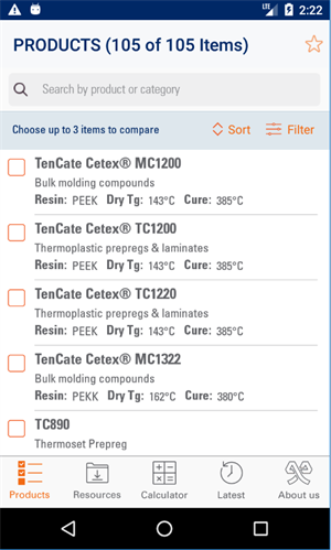
TenCate Products page

he ListView in the products page:


<ListView Grid.Row="2" x:Name="LstProducts" SeparatorVisibility="None"

              ItemsSource="{Binding ProductItems}" HasUnevenRows="True">

    <ListView.Behaviors>

        <behavior:EventToCommandBehavior EventName="ItemTapped"

                Command="{Binding SelectProductCommand}"

                EventArgsConverter="{StaticResource ItemTappedConverter}" />

    </ListView.Behaviors>

    <ListView.ItemTemplate>

        <DataTemplate>

            <ViewCell>

                <Grid Padding="5,5,14,0" BackgroundColor="White">

                    <Grid.ColumnDefinitions>

                        <ColumnDefinition Width="30" />

                        <ColumnDefinition Width="*" />

                    </Grid.ColumnDefinitions>

                    <mr:StackLayout Grid.Column="0" DownCommand="{BindingBindingContext.CheckProductCommand, Source={x:Reference Name=ProductsPage}}"

                                    DownCommandParameter="{Binding .}"HorizontalOptions="FillAndExpand" VerticalOptions="FillAndExpand">

                        <Image Margin="3" HeightRequest="25"

                                  Source="{Binding Compare, Converter={StaticResourceYesNoCheckBoxConverter}}" />

                    </mr:StackLayout>

                    <Grid Grid.Column="1" RowSpacing="0">

                        <Grid.RowDefinitions>

                            <RowDefinition Height="23" />

                            <RowDefinition Height="20" />

                            <RowDefinition Height="22" />

                            <RowDefinition Height="5" />

                            <RowDefinition Height="1" />

                        </Grid.RowDefinitions>

                        <Label Grid.Row="0" Text="{Binding Name}" Style="{StaticResource NameLabelStyle}" />

                        <Label Grid.Row="1" Text="{Binding Category}" Style="{StaticResource CategoryLabelStyle}" />

                        <StackLayout Grid.Row="2" Orientation="Horizontal"Spacing="10">

                            <StackLayout Orientation="Horizontal" IsVisible="{BindingHasResin}">

                                <Label Text="{i18n:Translate ResinSemiColon}" Style="{StaticResource AttributeLabelStyle}" />

                                <Label Text="{Binding ShowResinType}" Style="{StaticResource AttributeValueStyle}"/>

                            </StackLayout>

                            <StackLayout Orientation="Horizontal" IsVisible="{BindingHasDryTg_C}">

                                <Label Text="{i18n:Translate DryTgSemiColon}" Style="{StaticResource AttributeLabelStyle}" />

                                <Label Text="{Binding DryTg_C, StringFormat='{0}°C'}"Style="{StaticResource AttributeValueStyle}"/>

                            </StackLayout>

                            <StackLayout Orientation="Horizontal" IsVisible="{BindingHasDryTg_F}">

                                <Label Text="{i18n:Translate DryTgSemiColon}" Style="{StaticResource AttributeLabelStyle}" />

                                <Label Text="{Binding DryTg_F, StringFormat='{0}°F'}"Style="{StaticResource AttributeValueStyle}"/>

                            </StackLayout>

                            <StackLayout Orientation="Horizontal" IsVisible="{BindingHasCureOptimal_C}">

                                <Label Text="{i18n:Translate CureSemiColon}" Style="{StaticResource AttributeLabelStyle}" />

                                <Label Text="{Binding CureOptimal_C,StringFormat='{0}°C'}" Style="{StaticResource AttributeValueStyle}"/>

                            </StackLayout>

                            <StackLayout Orientation="Horizontal" IsVisible="{BindingHasCureOptimal_F}">

                                <Label Text="{i18n:Translate CureSemiColon}" Style="{StaticResource AttributeLabelStyle}" />

                                <Label Text="{Binding CureOptimal_F,StringFormat='{0}°F'}" Style="{StaticResource AttributeValueStyle}"/>

                            </StackLayout>

                        </StackLayout>

                        <BoxView Grid.Row="4" HeightRequest="1"HorizontalOptions="FillAndExpand" Color="{StaticResource GreyColor30}" />

                    </Grid>

                </Grid>

            </ViewCell>

        </DataTemplate>

    </ListView.ItemTemplate>

</ListView>

Now start the Device monitor. It will start in Device modus (DDMS) normally.
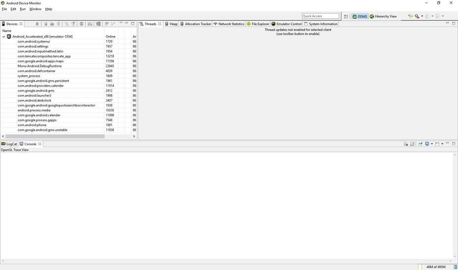
DDMS mode

So select Hierarchy Viewer in the top menu:

Hiearchy Viewer option

You should see the (emulator) device with a couple of running processes. One of these processes is your running app. 
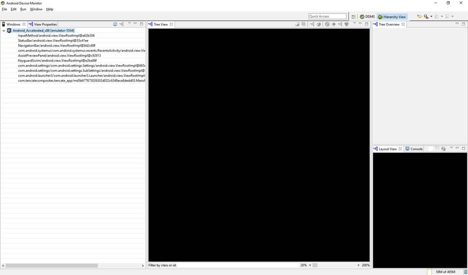
Android Emulator device

Double click on it. It will show the Visual Tree of the page in your app, in this example the Products page.
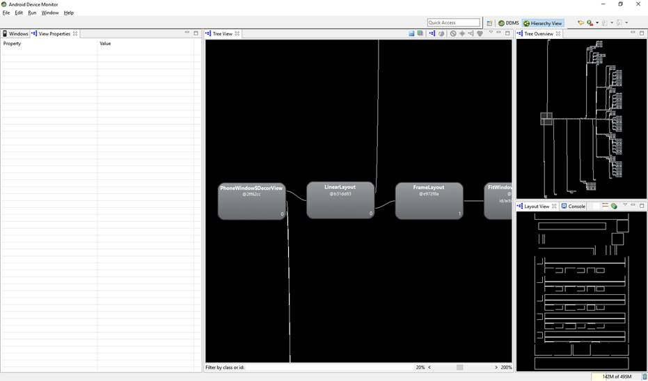
Visual Tree of the products page

Holding the mouse down you can drag the Visual tree. Scrolling the mouse wheel is for zooming in and out.
Clicking on a element will present it in the Layout View as well.
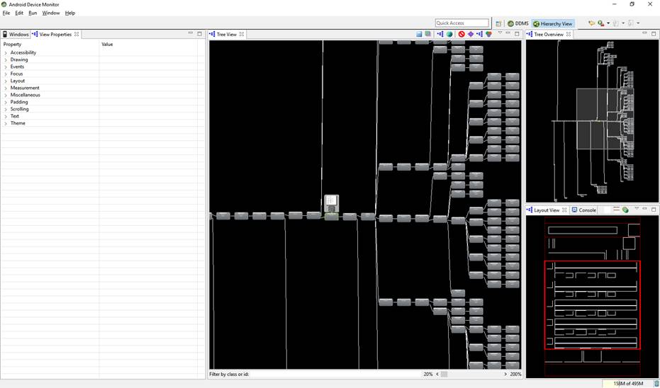
Products ListView element

For now we want to profile the Products ListView and interpret the results.

  1. In the Tree View or the Layout View, click on the view node whose children you want to profile.
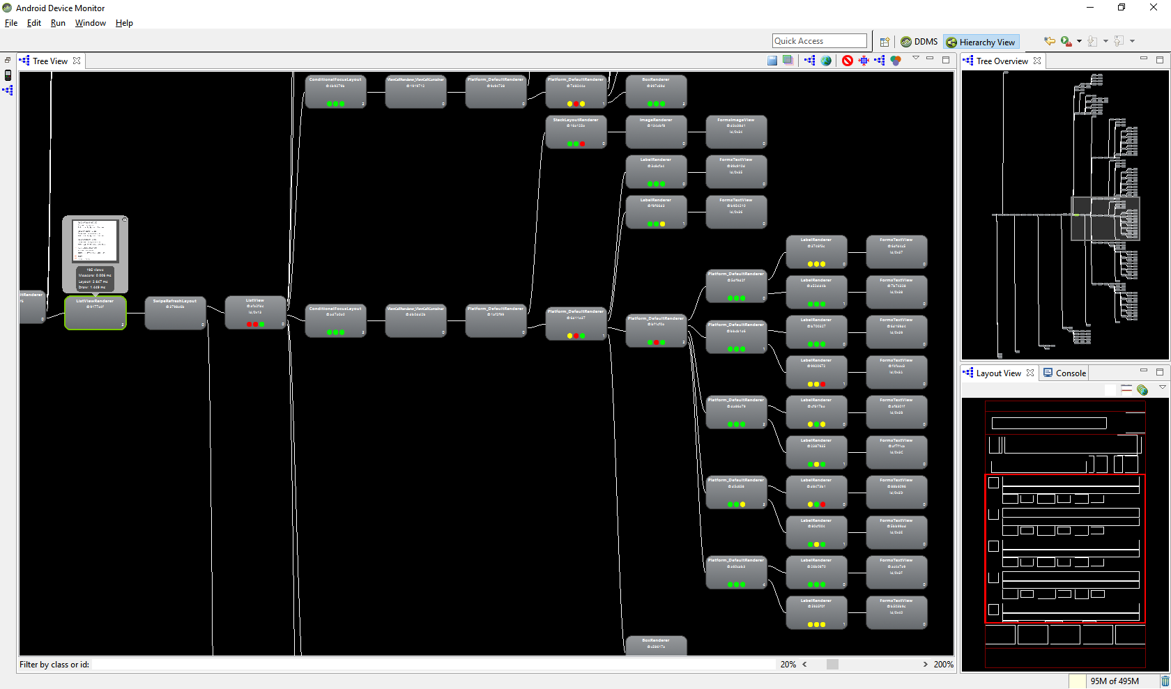
  2. To start profiling, click Obtain layout times  at the top of the Tree View.
    For large view hierarchies, profiling may take a few seconds.
    profiling icon

Profiling of listview
Each child view of your selected node gets three dots, which can be green, yellow, or red.

  • The left dot represents the draw process of the rendering pipeline.
  • The middle dot represents the layout phase.
  • The right dot represents the execute phase.

These dots roughly correspond to the measure, layout, and draw phases of the processing pipeline. The color of the dots indicates the relative performance of this node in respect to all other profiled nodes in the local family.

  • Green means the view renders faster than at least half of the other views.
  • Yellow means the view renders faster than the bottom half of the other views.
  • Red means the view is among the slowest half of views.

As you can see the product listview does have a real deep layout structure and the relative performance is not optimal in all levels so optimization is desirable.
Each item in the ListView does have a lot of visual elements. Here some changes can be made. The same ListView items can be presented with an AbsoluteLayout:

<ListView Grid.Row="2" x:Name="LstProducts" SeparatorVisibility="None"CachingStrategy="RecycleElement" BackgroundColor="White"

              ItemsSource="{Binding ProductItems}" HasUnevenRows="True">

    <ListView.Behaviors>

        <behavior:EventToCommandBehavior EventName="ItemTapped"

                Command="{Binding SelectProductCommand}"

                EventArgsConverter="{StaticResource ItemTappedConverter}" />

    </ListView.Behaviors>

    <ListView.ItemTemplate>

        <DataTemplate>

            <ViewCell>

                <AbsoluteLayout>

                    <mr:Image HeightRequest="25" Source="{Binding Compare, Converter={StaticResource YesNoCheckBoxConverter}}"

                              DownCommand="{Binding BindingContext.CheckProductCommand,Source={x:Reference Name=ProductsPageRef}}"

                             DownCommandParameter="{Binding .}"AbsoluteLayout.LayoutBounds="5,2,25,25" />


                    <Label Text="{Binding Name}" Style="{StaticResourceNameLabelStyle}" AbsoluteLayout.LayoutBounds="50,2,AutoSize,AutoSize" />

                    <Label Text="{Binding Category}" Style="{StaticResourceCategoryLabelStyle}" AbsoluteLayout.LayoutBounds="50,25,AutoSize,AutoSize" />


                    <Label IsVisible="{Binding HasResin}"AbsoluteLayout.LayoutBounds="50,45,AutoSize,AutoSize"

                           FormattedText="{Binding ShowResinType}">

                    </Label>


                    <BoxView HeightRequest="1" Margin="0,0,0,5"HorizontalOptions="FillAndExpand" Color="{StaticResource GreyColor30}"

                             AbsoluteLayout.LayoutBounds="50,70,1,AutoSize"

                             AbsoluteLayout.LayoutFlags="WidthProportional" />

                </AbsoluteLayout>

            </ViewCell>

        </DataTemplate>

    </ListView.ItemTemplate>

</ListView>  

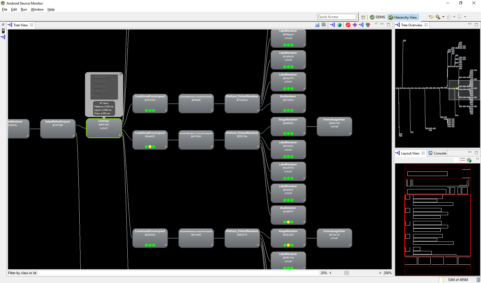
This new ListView implementation will look in the Hiearchy Viewer more optimized. The Visual tree size is only 4 levels instead of 10 and the profiling parametsr should almost all green.:

Optimized ListView


About us

Milèstre is a digital development agency based in Maastricht and operating all over the world. Since 2003 we build software solutions together with established companies and great startups. During the years we have developed a process that enables us to transform ideas into meaningful, intelligent and designfull experiences for mobile and web. A process where strategy, design, development and user experience are playing an important rol.


Contact us

Milestre BV
Ambyerstraat Zuid 82
6225 AJ Maastricht
Netherlands

Tel: +31(0)43 - 4070780
Email: info@milestre.nl
Recent Posts

Sep 07, 2018

Xamarin Forms: Performance matters with Hierarchy Viewer


In the previous post of 'Xamarin Forms: Performance matters' I was looking for an optimization of the overdraw of pixels in a page, in this post I will focus on reducing the Visual Tree Size of a page. Reducing the number of elements on a page will make the page render faster.
There are two main techniques for achieving this:

  1. Hide elements that aren't visible. The IsVisible property of each element determines whether the element should be part of the visual tree or not.
  2. Remove unnecessary elements.

A tool that can present the Visual Tree of a page: Hierarchy Viewer in Android Device Monitor. Although the Hierarchy Viewer is deprecated by Microsoft it still runs fine.
The Android Device Monitor can be executed:

  • in Visual Studio via menu item: Tools > Android > Android Device Monitor
  • in windows explorer: directory C:\Program Files (x86)\Android\android-sdk\tools. Run monitor.bat as Administrator

    Android Device Monitor

The Hierarchy Viewer doesn't run on a couple of devices; with the Android emulator the Hierarchy Viewer works fine. So before you start the Android Device monitor you have to start your app in the Android emulator and navigate to the page you want to view in the Hierarchy Viewer, for instance the Products page.

TenCate Products page

he ListView in the products page:


<ListView Grid.Row="2" x:Name="LstProducts" SeparatorVisibility="None"

              ItemsSource="{Binding ProductItems}" HasUnevenRows="True">

    <ListView.Behaviors>

        <behavior:EventToCommandBehavior EventName="ItemTapped"

                Command="{Binding SelectProductCommand}"

                EventArgsConverter="{StaticResource ItemTappedConverter}" />

    </ListView.Behaviors>

    <ListView.ItemTemplate>

        <DataTemplate>

            <ViewCell>

                <Grid Padding="5,5,14,0" BackgroundColor="White">

                    <Grid.ColumnDefinitions>

                        <ColumnDefinition Width="30" />

                        <ColumnDefinition Width="*" />

                    </Grid.ColumnDefinitions>

                    <mr:StackLayout Grid.Column="0" DownCommand="{BindingBindingContext.CheckProductCommand, Source={x:Reference Name=ProductsPage}}"

                                    DownCommandParameter="{Binding .}"HorizontalOptions="FillAndExpand" VerticalOptions="FillAndExpand">

                        <Image Margin="3" HeightRequest="25"

                                  Source="{Binding Compare, Converter={StaticResourceYesNoCheckBoxConverter}}" />

                    </mr:StackLayout>

                    <Grid Grid.Column="1" RowSpacing="0">

                        <Grid.RowDefinitions>

                            <RowDefinition Height="23" />

                            <RowDefinition Height="20" />

                            <RowDefinition Height="22" />

                            <RowDefinition Height="5" />

                            <RowDefinition Height="1" />

                        </Grid.RowDefinitions>

                        <Label Grid.Row="0" Text="{Binding Name}" Style="{StaticResource NameLabelStyle}" />

                        <Label Grid.Row="1" Text="{Binding Category}" Style="{StaticResource CategoryLabelStyle}" />

                        <StackLayout Grid.Row="2" Orientation="Horizontal"Spacing="10">

                            <StackLayout Orientation="Horizontal" IsVisible="{BindingHasResin}">

                                <Label Text="{i18n:Translate ResinSemiColon}" Style="{StaticResource AttributeLabelStyle}" />

                                <Label Text="{Binding ShowResinType}" Style="{StaticResource AttributeValueStyle}"/>

                            </StackLayout>

                            <StackLayout Orientation="Horizontal" IsVisible="{BindingHasDryTg_C}">

                                <Label Text="{i18n:Translate DryTgSemiColon}" Style="{StaticResource AttributeLabelStyle}" />

                                <Label Text="{Binding DryTg_C, StringFormat='{0}°C'}"Style="{StaticResource AttributeValueStyle}"/>

                            </StackLayout>

                            <StackLayout Orientation="Horizontal" IsVisible="{BindingHasDryTg_F}">

                                <Label Text="{i18n:Translate DryTgSemiColon}" Style="{StaticResource AttributeLabelStyle}" />

                                <Label Text="{Binding DryTg_F, StringFormat='{0}°F'}"Style="{StaticResource AttributeValueStyle}"/>

                            </StackLayout>

                            <StackLayout Orientation="Horizontal" IsVisible="{BindingHasCureOptimal_C}">

                                <Label Text="{i18n:Translate CureSemiColon}" Style="{StaticResource AttributeLabelStyle}" />

                                <Label Text="{Binding CureOptimal_C,StringFormat='{0}°C'}" Style="{StaticResource AttributeValueStyle}"/>

                            </StackLayout>

                            <StackLayout Orientation="Horizontal" IsVisible="{BindingHasCureOptimal_F}">

                                <Label Text="{i18n:Translate CureSemiColon}" Style="{StaticResource AttributeLabelStyle}" />

                                <Label Text="{Binding CureOptimal_F,StringFormat='{0}°F'}" Style="{StaticResource AttributeValueStyle}"/>

                            </StackLayout>

                        </StackLayout>

                        <BoxView Grid.Row="4" HeightRequest="1"HorizontalOptions="FillAndExpand" Color="{StaticResource GreyColor30}" />

                    </Grid>

                </Grid>

            </ViewCell>

        </DataTemplate>

    </ListView.ItemTemplate>

</ListView>

Now start the Device monitor. It will start in Device modus (DDMS) normally.

DDMS mode

So select Hierarchy Viewer in the top menu:

Hiearchy Viewer option

You should see the (emulator) device with a couple of running processes. One of these processes is your running app. 

Android Emulator device

Double click on it. It will show the Visual Tree of the page in your app, in this example the Products page.

Visual Tree of the products page

Holding the mouse down you can drag the Visual tree. Scrolling the mouse wheel is for zooming in and out.
Clicking on a element will present it in the Layout View as well.

Products ListView element

For now we want to profile the Products ListView and interpret the results.

  1. In the Tree View or the Layout View, click on the view node whose children you want to profile.
  2. To start profiling, click Obtain layout times  at the top of the Tree View.
    For large view hierarchies, profiling may take a few seconds.
    profiling icon

Profiling of listview
Each child view of your selected node gets three dots, which can be green, yellow, or red.

  • The left dot represents the draw process of the rendering pipeline.
  • The middle dot represents the layout phase.
  • The right dot represents the execute phase.

These dots roughly correspond to the measure, layout, and draw phases of the processing pipeline. The color of the dots indicates the relative performance of this node in respect to all other profiled nodes in the local family.

  • Green means the view renders faster than at least half of the other views.
  • Yellow means the view renders faster than the bottom half of the other views.
  • Red means the view is among the slowest half of views.

As you can see the product listview does have a real deep layout structure and the relative performance is not optimal in all levels so optimization is desirable.
Each item in the ListView does have a lot of visual elements. Here some changes can be made. The same ListView items can be presented with an AbsoluteLayout:

<ListView Grid.Row="2" x:Name="LstProducts" SeparatorVisibility="None"CachingStrategy="RecycleElement" BackgroundColor="White"

              ItemsSource="{Binding ProductItems}" HasUnevenRows="True">

    <ListView.Behaviors>

        <behavior:EventToCommandBehavior EventName="ItemTapped"

                Command="{Binding SelectProductCommand}"

                EventArgsConverter="{StaticResource ItemTappedConverter}" />

    </ListView.Behaviors>

    <ListView.ItemTemplate>

        <DataTemplate>

            <ViewCell>

                <AbsoluteLayout>

                    <mr:Image HeightRequest="25" Source="{Binding Compare, Converter={StaticResource YesNoCheckBoxConverter}}"

                              DownCommand="{Binding BindingContext.CheckProductCommand,Source={x:Reference Name=ProductsPageRef}}"

                             DownCommandParameter="{Binding .}"AbsoluteLayout.LayoutBounds="5,2,25,25" />


                    <Label Text="{Binding Name}" Style="{StaticResourceNameLabelStyle}" AbsoluteLayout.LayoutBounds="50,2,AutoSize,AutoSize" />

                    <Label Text="{Binding Category}" Style="{StaticResourceCategoryLabelStyle}" AbsoluteLayout.LayoutBounds="50,25,AutoSize,AutoSize" />


                    <Label IsVisible="{Binding HasResin}"AbsoluteLayout.LayoutBounds="50,45,AutoSize,AutoSize"

                           FormattedText="{Binding ShowResinType}">

                    </Label>


                    <BoxView HeightRequest="1" Margin="0,0,0,5"HorizontalOptions="FillAndExpand" Color="{StaticResource GreyColor30}"

                             AbsoluteLayout.LayoutBounds="50,70,1,AutoSize"

                             AbsoluteLayout.LayoutFlags="WidthProportional" />

                </AbsoluteLayout>

            </ViewCell>

        </DataTemplate>

    </ListView.ItemTemplate>

</ListView>  

This new ListView implementation will look in the Hiearchy Viewer more optimized. The Visual tree size is only 4 levels instead of 10 and the profiling parametsr should almost all green.:
Optimized ListView


© Copyright 2022 - Milestre BV
Top